
Why Brand Expressions Exist
EurekaGO operates on two distinct layers. The institutional layer — documented throughout this playbook — is precise, authoritative, and global. It closes the Visionary Gap. It earns the trust of investors and B2B decision makers. It is the language of someone who has already reached the destination.
The institutional layer is not enough.
The founders who actually use EurekaGO every day — who felt the pain before they found the solution, who still feel both acutely — do not primarily communicate in institutional language. They communicate the way people talk honestly: in a chat message, across a coworking table, in a moment of shared exasperation or shared celebration. Reaching them requires a different register entirely.
Brand expressions are not merchandise. They are not decorative add-ons to the "real" brand. They are positioning work executed in a different format — one that operates where the institutional voice cannot go, says what the institutional voice cannot say, and reaches people the institutional voice cannot reach.
They do four things that no other brand touchpoint can do as efficiently.
The Sticker System
The primary format for brand expressions is the sticker. The choice is not arbitrary. Stickers are the format with the highest signal-to-cost ratio in brand communication: cheap to produce, permanent once placed, highly visible in the environments where founders spend time — coworking spaces, events, startup meetups, home offices.
Each sticker in the system is built on a single structural logic: one sticker names the enemy, one sticker names the relief. The two always exist as a pair, even if deployed independently. Together they tell the full story of what EurekaGO removes and what it delivers — in the language of the founder, not the brand.
- Names the enemy explicitly
- Expresses exasperation, not rage
- Specific — the more specific, the more resonant
- Founder identifies with the character
- Character: fed-up, chronic exhaustion
- Names the reward — not the product
- Expresses earned confidence, not hype
- Internal rhyme in the copy
- Founder identifies with the character
- Character: quiet, knowing, settled
The pain sticker and relief sticker are not the same character in different moods. They are two different animals — each chosen to embody a specific emotional state. The founder who sees the pain sticker thinks: that's me, right now. The founder who sees the relief sticker thinks: that's who I want to be. The aspiration is quiet, not loud. The character does not celebrate — it already knew.
Visual Rules
The visual language of brand expressions is deliberately different from the institutional layer — that difference is a feature, not a bug. The institutional layer is geometric, clean, typographic, architectural. Brand expressions draw from vintage tattoo flash art: bold, hand-feel, high-contrast, instantly iconic at small scale.
What makes the tattoo flash aesthetic the right choice is not nostalgia. It is the fact that it was built to communicate maximally in a small format, with a single colour (black), at a glance. These are exactly the constraints of a sticker.
- Colour Black and white only. No colour, no gradients, no halftones. The EUREKAGO badge may use a solid black field. The restriction is absolute — no exceptions for verticals.
- Line weight Thick, confident outlines throughout. Fills are solid black or solid white — never screened, never grey. Where texture is used (fur, fabric) it is rendered in clean ink strokes, not photographic gradients.
- Style reference Sailor Jerry tattoo flash. Vintage biker patch art. Old-school woodcut illustration. The character should feel immediately readable at 6×8 cm sticker size.
- Format Die-cut irregular edge that follows the shape of the composition. White background within the cut. Top and bottom banner ribbons carry the copy in caps, serif-adjacent display type.
- Badge The EUREKAGO badge appears top-right of every sticker, inside the die-cut. Black pill or rectangle, white text. Sized to be visible but never dominant — a signature, not a shout. Mirrors the endorser logic of the master brand architecture.
- Characters Minimally humanised animals. No full costumes, no props in hand unless the prop is central to the concept. The character should feel animal-first, with just enough human legibility to carry emotion. See Chapter 05.
Copy System
The copy on brand expressions operates by completely different rules from the institutional voice. Where the institutional layer is precise and avoids claims it cannot substantiate, the street layer is visceral and names what it feels. Where the institutional layer is global and avoids cultural specificity, the street layer speaks the native register of its audience.
EXCEL DEBATING
MONEY WALKS
The language for master brand expressions is English, consistent with EurekaGO's global-first positioning. Vertical expressions may adapt to the language of their primary market — EurekaBike and Ledgera operating initially in Italy may use Italian copy that matches the intimate register of the audience.
Character System
Each brand expression uses an animal character. The animal is not a mascot — it does not represent EurekaGO. It represents the founder at a specific emotional moment. The founder who sees the pain character thinks: that is me right now. The founder who sees the relief character thinks: that is who I intend to be.
Characters are chosen for their natural emotional legibility — the animal must embody the feeling before any illustration choices are made. A bulldog is already exhausted. A wolf already knows before anyone else does. The illustration amplifies the inherent expression; it does not manufacture it.
The key distinction from typical brand characters: these animals are minimally humanised. They are not dressed, they do not hold objects as props, they are not posed artificially. The human element comes through the emotional rendering of the face and posture — everything else stays animal. The less human clothing and props, the more the founder identifies directly with the character rather than watching a cartoon.
The bulldog's natural expression — heavy jowls, drooping eyes, the permanent look of someone who has seen too much — does 90% of the emotional work before the illustration begins. It does not need to be angry. It needs to be tired. The exhaustion of someone who has sat through the same Excel meeting forty-seven times and is still being asked to join another one.
Expression: chronic resignation, not active rage. The furrowed brow is softened — this is bone-deep exasperation, not a tantrum. Surrounding elements reference the specific enemy named in the copy (spreadsheets, disconnected tools, bureaucratic documents).
The founder sees this and thinks: yes. Exactly this. That is the recognition that makes a sticker worth putting on a laptop.
The wolf embodies the specific quality of confidence that comes from having a system — not luck, not hustle, not talent alone, but a reliable mechanism that produces outcomes predictably. The wolf already knew before anyone else did. It is settled, not celebrating. The win was expected.
Expression: calm and knowing. A slight pull at the corner of the mouth — not a grin, not a smirk. Ears forward, eyes sharp. The posture of an animal that has just turned its head because it already heard the result before it happened. Surrounding elements reference the outcome named in the copy (data flows, clean charts, money in motion).
The founder sees this and thinks: that is who I am when the system is running. The aspiration is embodied, not stated.
One animal per emotional role per brand. The bulldog and wolf are the master brand pair. When expanding to verticals, new animals are chosen for each vertical's pain/relief pair — they do not reuse the master brand characters. Each vertical builds its own pair from scratch using the same selection criteria: natural emotional legibility, minimal humanisation required, immediate recognisability.
Approved Executions — EurekaGO Master Brand
These are the two approved stickers for the EurekaGO master brand. Both generated May 2026. Both approved for production and distribution.
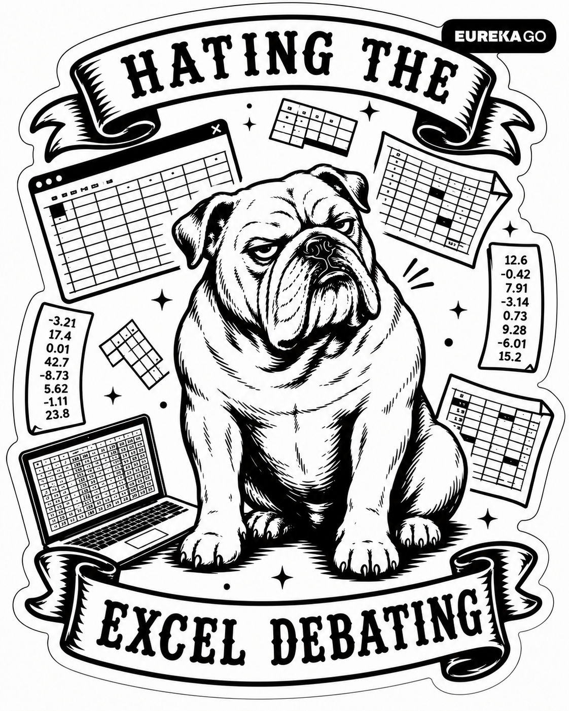

Both stickers carry the EUREKAGO badge top-right, inside the die-cut. The badge uses the endorser version of the wordmark — Archivo Regular, white on black, small pill format. Its function is a signature, not a logo lockup. It should be visible; it should never dominate.
Expansion to Verticals
Each vertical brand — EurekaBike, EurekaLedger, and any future vertical — develops its own sticker pair independently. The system architecture (one pain sticker + one relief sticker, one animal per role) is fixed. The specific enemy, the specific relief, the characters, and the copy language are all vertical-specific.
Vertical expressions may use the language of their primary market. An Italian-market vertical may use Italian copy — with the same register requirements: specific, visceral, founder-intimate, internally rhymed on the relief sticker.
| Vertical | Market | Pain — Enemy to Name | Relief — Reward to Name | Status |
|---|---|---|---|---|
| EurekaGO Master | Global · EN | The consultant with the Excel | Data-driven outcomes, money moving | Approved ✓ |
| EurekaBike | Italy · IT | Inventory chaos, low margins, seasonal blindness | Orders predicted, restock automatic | To develop |
| EurekaLedger | Italy · IT | Prima nota, manual reconciliation | Books close, numbers align | To develop |
When developing a new vertical sticker pair, the process follows a fixed sequence. First: identify the one most specific pain — not a category of frustration but a precise, named moment that the target audience will immediately recognise. Second: identify the one most specific relief — not a feature but a felt outcome, expressed in the founder's own words. Third: find the animal whose natural expression matches the emotional state without any illustration work. Fourth: develop the copy, test the rhyme on the relief sticker. Fifth: generate, review for style consistency with the master brand pair, approve.